Responsive Design Meets Personalisation: Future-Proof Your Marketo Templates
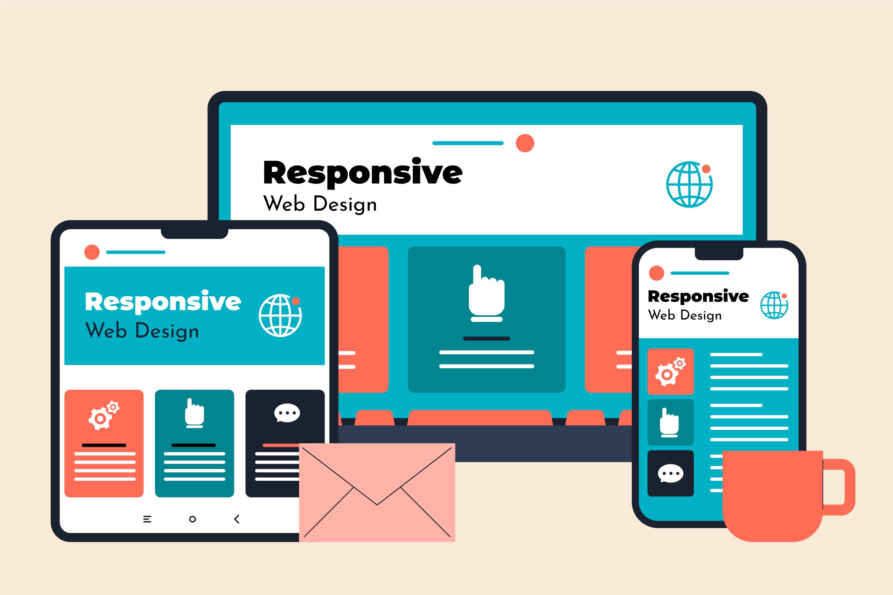
Photo by freepik @ freepik
Email in 2025 doesn’t sit still. It bends, shifts, adapts. It moves across screens, learns from behaviour, listens to signals, and responds in real time.
Your subscribers? They don’t just skim. They expect instant relevance. They expect layouts that behave beautifully on every device. They expect personalisation that feels natural, not engineered.
This is why responsive design alone isn’t enough. And why personalisation alone won’t save a poorly structured template. This is precisely why you should integrate Marketo's responsive email design into your campaigns.
In 2025, the winners in the inbox are the brands that blend the two at the template level, before campaigns go live, before segmentation kicks in, before journeys unfold. And 2026 doesn’t seem any different.
So, if you’re ready to learn how Marketo responsive email templates can help you boost conversions and retain clients through responsive design and personalisation, you have landed at the right place.
Table of Contents
|
Let’s step into the new era of Marketo email development, where templates flex to fit every device, and content flexes to fit every human.
Significance of responsive and personalised Marketo Templates
Responsive design ensures your email adapts fluidly and elegantly to the device in hand.
In Marketo, responsive templates rely on:
- Fluid layouts that scale gracefully
- Hybrid coding that satisfies Gmail, Outlook, and Apple Mail simultaneously
- Breakpoints that restructure content for small screens
- Mobile-first logic that ensures clarity under the constraints of thumb-driven reading
While Marketo doesn’t inherently “create” responsiveness, the platform supports it through:
- Editable modules
- Locked structural sections
- Mobile CSS overrides
- Template-level rendering rules
Marketo's responsive email layout is engineered, not assembled.
What is email personalisation in Marketo?
Personalisation in Marketo is the art and science of using:
- Tokens ({{lead.First Name}}, {{company.Industry}})
- Dynamic content blocks
- Segmentation rules
- Behaviour-based triggers
- Velocity scripting
Together, they create messages that reflect a user’s identity, behaviour, and intent.
Think:
- A SaaS product recommendation powered by usage data
- A retail email adjusting imagery based on gender or location
- A renewal reminder tailored to the subscription tier
- A B2B nurture path adjusting based on account scoring
Personalisation isn’t a gimmick. It’s about relevance. And relevance drives action.
Why must responsive design and personalisation work together?
Here are three reasons why responsive design and personalisation must go hand in hand.
1. Evolving customer expectations
Today’s subscriber wants:
- Fast loading
- Visually clean interfaces
- Messages tailored to their moment
- Mobile-first readability
- A sense of being understood
Device fragmentation adds pressure, with smartphones, tablets, foldables, and dual-screen devices. Behavioural fragmentation adds more late-night browsing, on-the-go reading, and quick scanning between tasks.
Responsive + personalised templates solve both challenges at once.
2. Role of AI and predictive insights in 2025
AI doesn’t replace marketing. It sharpens it.
Marketo’s predictive features, propensity scoring, suggested audiences, send-time optimisation, shape personalised experiences with:
- Context
- Timing
- Behavioral cues
AI identifies the “why.” Responsive design delivers the “how.” Personalisation fills in the “what.”
Together, they produce messages that feel almost… inevitable.
3. Impact on deliverability, engagement, and conversions
Responsive design impacts:
- Bounce rates
- Scroll depth
- Readability
- Mobile conversions
Personalisation impacts:
- Click-through rates
- Content relevance
- Micro-conversions
- Long-term engagement
When both align, brands see:
- Higher inbox placement
- Deeper interaction
- More consistent revenue per send
Responsive design keeps users reading. Personalisation keeps them clicking.
Read more: Mastering the Art of Digital Marketing: Strategies for Success
Building future-proof responsive Marketo templates
Here are four crucial ways to build future-proof responsive Marketo templates.
1. Modular, scalable template architecture
2025 is the age of modular systems.
Marketo’s Email 2.0 Editor thrives on:
- Reusable building blocks
- Editable content zones
- Locked structural modules
- Drag-and-drop flexibilities
Modular architecture:
- Speeds production
- Protects brand consistency
- Supports personalisation scenarios
- Makes multi-market scalability effortless
Future-proof templates don’t break when content changes. They adapt.
2. Hybrid coding techniques for multi-client compatibility
Every developer’s challenge: Make one template work flawlessly in:
- Gmail
- Outlook (desktop & web)
- Apple Mail
- Mobile apps
Hybrid coding is the modern solution. Partly fluid. Partly responsive. But all resilient. The key elements to build through hybrid coding are:
- Table-based HTML
- Max-width containers
- Fluid images
- Bulletproof CTAs
- Retina optimization
- Conditional comments for Outlook
- Style inlining for cross-client support
Hybrid coding is the difference between “it looks okay” and “it looks exceptional everywhere.”
3. Accessibility as a core responsive requirement
Responsive and accessible go hand in hand. Accessibility requires:
- Alt text
- Semantic structure
- Meaningful headings
- High contrast
- Dark mode compatibility
- Large tap-friendly CTAs
- Live text over images
Accessible templates don’t just pass audits. They reach people.
4. Advanced visual adaptation for multi-device rendering
Modern responsive design must adjust:
- Hero images that reframe on mobile
- Grids that collapse gracefully
- Cards that maintain equal spacing
- CTAs that become centred and larger on small screens
So, you should design for:
- 2x and 3x pixel density
- Landscape and portrait
- High-brightness displays
- Dark mode inversions
Templates must be visually flexible without compromising their structural integrity.
Embedding personalisation at the template level
Here are 4 key methods of embedding personalisation at the template level.
1. Using Marketo tokens and snippets strategically
Tokens make personalisation scalable. You can use:
- Lead tokens for user-level personalisation
- Program tokens for offer-level variation
- System tokens for date, time, and sender details
- Snippets for region-specific or product-specific messaging
Proper token logic prevents:
- Lagging load times
- Missing values
- Broken dynamic fields
Tokens act as placeholders for personalisation. Snippets act as building blocks for localisation.
2. Dynamic content for segmented experiences
Dynamic content allows templates to change shape and message based on:
- Location
- Persona
- Industry
- Behavior
- Product interest
The framework must support:
- Varying text lengths
- Alternate imagery
- Multi-language spacing
- Variable content heights
Responsive + dynamic content = predictable performance.
3. Velocity scripting for advanced personalisation
Velocity scripting is where personalisation becomes intelligent.
Use cases include:
- Personalised product grids
- Dynamic CTAs
- Conditional content visibility
- Logic-driven recommendations
- Polished fallback rules when data is missing
Velocity elevates personalisation from simple tokens to contextual storytelling.
4. Real-time behaviour and data-driven personalisation
Marketo’s integration with CRMs and third-party tools allows templates to respond to:
- Browsing behavior
- Lead score thresholds
- Engagement frequency
- Purchase history
- Predictive scoring
Real-time personalisation lets an email adapt based on what happened minutes before it was sent. Let’s see it from the technical lens of Marketo templates.

Supplementary reading: How to Personalise Marketing Campaigns Using CRM Tools
Technical considerations for responsive and personalised Marketo templates
Here are three crucial technical considerations for responsive and personalised Marketo templates you just can’t ignore.
1. Template structure and HTML framework
The best practices for template structure and HTML framework include:
- Clean table structure
- Minimal nested tables
- Locked modules for branding
- Flexible editable areas
- Clear naming conventions
- Predictable module stacking
You should avoid:
- Inline styles that break in editors
- Overly complex structures
- Hidden CSS hacks that Outlook strips
Simplicity scales. Complexity breaks.
2. Performance and loading optimisation
2025 audiences expect speed. You can optimise by:
- Compressing images
- Using correct file types
- Inlining CSS
- Removing unnecessary scripts
- Avoiding large GIFs
- Enabling fallback-safe rendering
Mobile-first deliverability depends on performance.
3. Testing across devices, clients, and personalisation variants
Testing now requires:
- Multi-client rendering tests
- Personalisation logic checks
- Token population tests
- Dark mode previews
- Accessibility scans
- Mobile interaction tests
A template isn’t “tested” unless it passes at least 20–30 variants.
4. Integrating analytics, tracking, and buyer-journey logic
Every personalised template must include:
- UTM parameters
- Marketo tracking links
- Named CTA tracking
- Behaviour-based segmentation logic
Personalisation without measurement is guesswork. Measurement without design is directionless.
Why does this combination matter for marketing success?
Responsive + personalised Marketo templates transform:
- Lead nurturing
- ABM workflows
- Sales enablement
- Onboarding journeys
- Renewal messaging
- Re-engagement campaigns
- Product launch series
And needless to say, this combination drives:
- Higher engagement
- Stronger conversions
- Shorter sales cycles
- Better data insights
- Lower production burden
When done right, templates stop being assets. They become engines.
Need some more advanced tips? We have got your back.
Final thoughts and best practices for effective implementation
Here are some pro tips from our experts to help you implement responsive, personalised designs in your Marketo templates effectively.
For Marketers | For Designers | For Developers |
| Segment with intent, not assumption | Design modular, adaptive systems | Follow hybrid responsive coding standards |
| Personalise only where value is added | Consider content variability early | Validate token and snippet logic |
| Revisit template performance quarterly | Build for accessibility from day one | Document template frameworks |
| Govern personalisation rules to prevent bloat | Ensure templates hold visual balance at all sizes | Optimise for speed, compatibility, and scale |
Wrapping up
That brings us to the business end of this article, where it’s fair to say that responsive design makes your message readable. Personalisation makes your message meaningful.
But beyond 2025, Marketo templates must do both—simultaneously, intelligently, and consistently.
The brands that adopt modular, future-proof, responsive, and personalised email frameworks will outperform those that rely on outdated, static designs.
Now is the moment to audit your templates. Redesign your architecture. Rebuild your system for the audience you serve today, and the one arriving tomorrow.
Ready to rethink your Marketo email strategy? Start where the future begins: with templates designed for every device, every moment, and every person.

Business
Tags: Alignment & Clarity, Building Functional Competencies, Business Management, Competence, Communication, Consultant Corner

Ahmad works as a content writer at Mavlers. He’s a computer engineer obsessed with his time, a football enthusiast with an MBA in Marketing, and a poet who fancies being a stage artist. Entrepreneurship, startups, and branding are his only love interests.